0

jo taillieu

Pachtwoning . Groot-Bijgaarden

jo taillieu architecten . photos: © Filip Dujardin

On the site of the former Wivina monastery in Groot-Bijgaarden, on the border of the walled property, stood a dilapidated tenant house. A single story house with a gable roof and small outbuildings. An accompanying entrance pavilion allowed for private access through the monastery wall. The whole is part of the protected heritage site of the monastery, which had to remain intact during the renovation. At the same time, there was a need to create a distance from the walkers in the public monastery garden. The design departs from a simple gesture: the four walls of the house were preserved and restored, while one of the ends of the gable roof has been moved halfway outside the volume. In that way, a patio was created within the existing walls of the house, which created the desired distance to the public domain, and a new room was created on the other side of the house amidst the surrounding greenery. Continue reading jo taillieu

0

Jo Taillieu

House Jozef . Brussels

Jo Taillieu . photos: © FILIP DUJARDIN

In the midst of green fields, south of Brussels, stood a 1960s modernist-looking villa. White-plastered walls, flat roofs and a garden pavilion. The new owner bought it because of its aesthetic appeal, which should not be lost when renovating it. The starting point of the design was to insulate the house from the inside following a clear logic: while the white outer walls of the original house remained, a new house was built inside with red brick. In addition, white building blocks were used to add a window or door in the old interior walls and re-arrange the spaces. The result is a new plan of nine rooms on the ground floor, joined more or less asenfilade, while a cross-shaped timber structure makes four new rooms on the first floor. The same logic was then continued in the garden pavilion, where a wellness and studio space were added. Continue reading Jo Taillieu

0

de Vylder Vinck . taillieu

FRIANT . Gent

de Vylder Vinck . taillieu . FRIANT . Gent Filip Dujardin afasia (1)

architecten Jan de Vylder Inge Vinck . jo taillieu architecten . photos: © Filip Dujardin

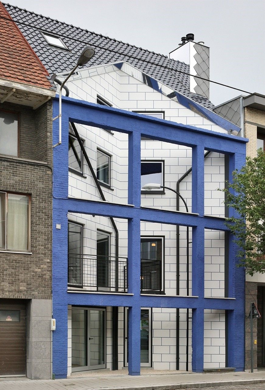
The house had a seemingly regular structure, nothing less was true. Though
the regular structure was even more given place. The new facade took a
triangular setback. The in between space good enough to give distance to the
street. The plan of the house busy. Continue reading de Vylder Vinck . taillieu

0

de Vylder Vinck . taillieu

Huik

de Vylder Vinck . taillieu . Huik Filip Dujardin afasia (1)

architecten Jan de Vylder Inge Vinck . jo taillieu architecten . photos: © Filip Dujardin

The tangible kink in the facade is marked neither more nor less than by the junction of two streets. The mental kink in the house no more or less than by a young and stringent budget.
Everything was half. The existing building can not be understood. The height is
there only for itself. At no time let the city stand in relation to the street. Even the brick has nothing to do with the city. The existing house has nothing to do with the city. Continue reading de Vylder Vinck . taillieu