Studio Anne Holtrop . photos: © Anne Holtrop
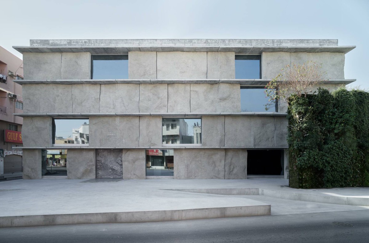
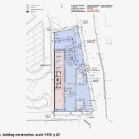
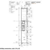
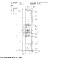
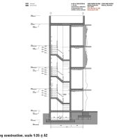
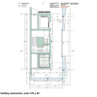
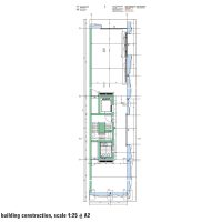
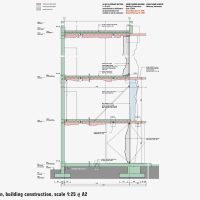
The building’s floor plan consists of two identical sized rooms and a core in between. The plan is very shallow in depth and has one long main facade with two short end facades. With the shallow depth of the plan, the facade itself is the main spatial element.
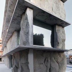
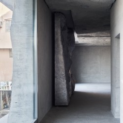
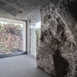
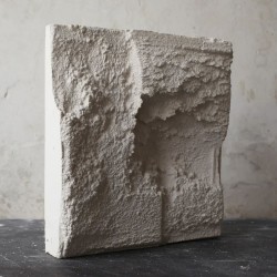
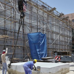
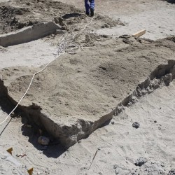
The facade is made out of sand casted structural wall elements with a strong relief. The elements are casted on the ground next to the building. Each cast results in a unique imprint on the element. At the position of the windows and the corners of the building, the relief is visible, as a geological cut in the ground.
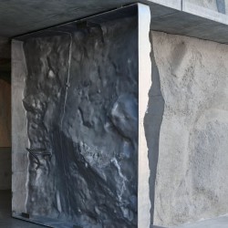
On the interior the sand casting is repeated in the concrete floor slabs, which are made in the same way. In front of the windows large shutters can be moved. The shutters (and the entrance door) are made out of sand casted aluminium with the relief facing towards the interior. Contrary to the concrete elements, the aluminium sand casts are hollow. Through the windows, the interior of the casts can be seen.
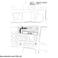
The Green Corner building takes it name from an existing corner with a vertical garden designed by Patrick Blanc. The building will be build against a parking, designed by Christian Kerez.
_

