Atelier Kempe Thill architects and planners . Atelier56S . photos: © Ulrich Schwarz
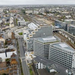
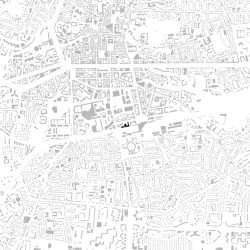
Rennes, France, the capital of Brittany, initiated several large urban development projects, the most spectacular of which is the reorganization of the entire train station area with the ZAC (Zone d’aménagement concerté) EuroRennes, including the completely new construction of the main train station.
Formal Urban Planning
This development is the logical consequence of the connection of Rennes to the TGV high-speed railway network to Paris, 350 kilometers away, with a journey time of just 100 minutes and trains running every hour. The station area has therefore increased significantly in value and given a real boost to the city’s urban development.
The French railway company SNCF has freed up a wide swathe of land along the tracks and is gradually selling it to the highest-bidding project developers. The city has founded a semipublic urban development company that links the allocation of land to competitions in which the design of the team of architects plays a decisive role. This is an attempt to ensure urban and architectural quality.
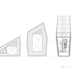
The FGP team of Philippe Gazeau and Louis Paillard, in collaboration with Agence Ter, was chosen as the master planner of the entire area. The master plan assumes that individual buildings stand next to each other as loose volumes similar to urban villas and smaller high-rise buildings, thereby creating an open city impression despite high urban density. The buildings form classic streets and squares. In addition, the master plan requires all buildings to have façades that slope in both plan and section, including façades that are designed to overhang in a “rock-like” manner to create an organic and sculptural effect.
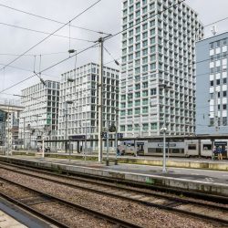
Atelier Kempe Thill, together with the Rennes-based architectural firm Atelier56S, were invited by the client Legendre Immobilier to the competition for the Beaumont construction site directly opposite the train platforms.
Hybrid Program
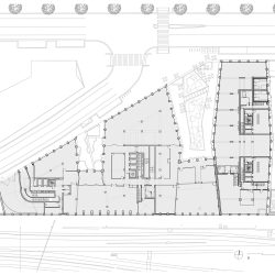
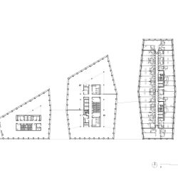
The program for the Beaumont project includes a total of about 31,000 square meters of gross floor area, which is roughly divided by half into apartments and offices. These areas are to be realized with a residential high-rise and two medium-rise office buildings, all of which are connected to each other on the ground floor.
The residential tower contains a very hybrid constellation of different types of housing. On the first five floors there are 121 studios in a kind of long-term hotel for rentals lasting several weeks, for example to business travelers. These units are between 16 and 22 square meters in size. The four floors above were handed over to the Rennes housing association as a total of forty-one social apartments with living spaces between 44 and 112 square meters. The top eight floors contain forty-six apartments between 36 and 155 square meters.
The office buildings are designed to create areas of between about 450 and 900 square meters per floor, thus meeting the requirements of the rental office market. Here the developers assume very different division options, starting with the smallest unit of half a floor.
So as to be able to respond adequately to the widely divergent programmatic requirements, all three buildings are designed with functionally neutral and flexibly divided floor plans. The construction consists of load-bearing façades in combination with load-bearing access cores. All partition walls, including those between the apartments, are made of lightweight construction.
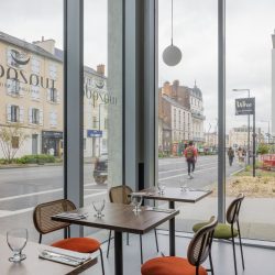
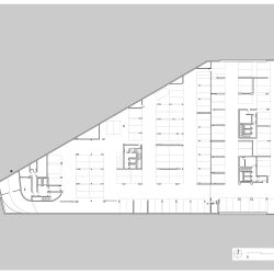
The ground floor offers space for several restaurants, a fitness club, and a large bicycle storage room with a repair workshop. The entire complex has a one-story basement for an underground car park.
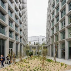
Between the building volumes, intermediate zones linked to the footpath will be created, each of which will function as expanded public spaces outdoors and will be designed as terraces with plants.
Conical Buildings
The architects were faced with the question of how to position themselves in this project, especially with regard to the urban planning requirements. Both offices stand for architecture based on logic and rationality, which finds a purely formal corset imposed from outside problematic. Thanks to a workshop-like competition process with several interim presentations, it quickly became clear that alternative designs which, for example, are layered more horizontally with multistory bases—therefore allowing more distance between the building volumes above—would not be accepted.
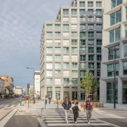
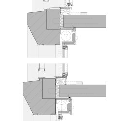
The discussions with the jury gave rise to the idea of using the required slopes in such a way that they not only create a formal gesture, but also increase the quality of life within the project. The narrow distances between the buildings are greatly improved by sloping floor plans, which open the spaces in between to the outside and thereby bring more light between the buildings and relax the visual relationships, especially in the apartments. The same strategy is used for the required vertical slope: the buildings have slightly inclined façades that open the spaces toward the sky and also provide more light. This is achieved through approximately 15-centimeter-deep recesses in the façades, which gives rise to a slightly pyramidal effect.
The result is a morphology that creates a physically tangible metropolitan density, accommodates great programmatic complexity, and at the same time enables high urban porosity, good visual connections, and as much light and sun as possible between the buildings.
Exoskeleton in Concrete
The fundamentally most cost-effective construction for residential and office buildings in France is still a load-bearing façade made of structural concrete in combination with a structural core, also made of concrete. Many French construction companies have developed their own thermal break for this system for connecting ceilings to façades in order to keep thermal bridges under control cost-effectively. The concrete is of rather low aesthetic quality and is usually covered.
The client for the Beaumont project is Legendre Immobilier, the development department of a medium-sized construction company specializing in concrete structures, which also owns its own precast factory.
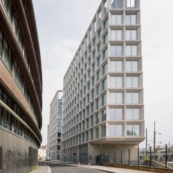
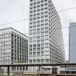
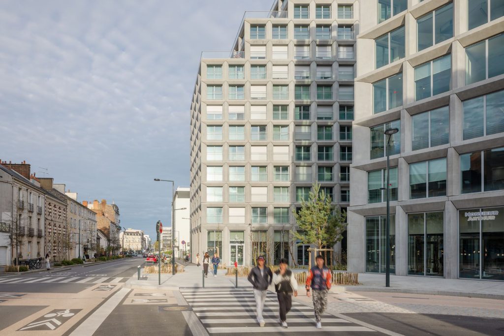
The architectural team took these remarkable circumstances as a design starting point and translated the construction logic common in France into a refined version of an exoskeleton with a façade made entirely of precast concrete elements. The idea is to design the shell aesthetically so that no cladding is required. Construction directly becomes architecture. This approach was made possible thanks to the design work as “Design & Build” in direct collaboration with the construction company with various mock-ups and “file-to-factory planning,” without the complicated conditions of a public tender.
The system is basically designed to be relatively simple in terms of columns and beams. Visually, the beams span from one column to the next, but in reality the system has been rationalized and the beams largely span over two supports, but then have a visually important false joint above the middle support. Columns and beams are designed with inward bevels, again in continuation of the large, beveled shape of the buildings, here with the aim of allowing more light into the apartments. The beveling of the finished parts also creates a tapering in the external view, which gives the inherently heavy components more lightness and elegance. The corner columns are mitered so that the façade runs evenly all around.
In contrast to most other European countries, the risk of thermal stresses with possible dangerous cracks due to this externally placed support structure, as well as the watertightness, especially of the structural nodes, which at first glance seems difficult, are seen as manageable. The setbacks of the façade on each floor are ensured by the receding supports, which, despite the receding, still have plenty of overlap with the support underneath so that enough reinforcing material can be passed through.
The concrete is removed and remains untreated apart from a water-repellent impregnation. The quality of the concrete is the decisive element for the final appearance of the building.
As a conscious design strategy, the architectural language of deep concrete elements helps to respond to various unforeseeable things, such as occasionally differing window systems, while still maintaining a robust design backbone.
Egalitarian Spatial Concept
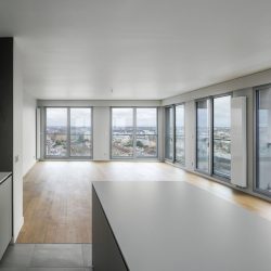
In terms of space, the project assumes approximately the same spatial conditions between offices and apartments. This starting point creates great flexibility in terms of floor plan layout while maintaining a similar generous spatial quality. Due to the large number of floor-to-ceiling windows per apartment, which ultimately allow the entire interior to be opened to the outside, there were no extra balconies or winter gardens. The supports provide a neutral grid with similar window sizes everywhere. In the high-rise residential building, each window is combined with a narrow balcony, similar to the balconies along the Haussmann boulevards in Paris.
Office and residential floors have standard heights. The ground floor has an average gross height of about 5 meters throughout. This creates a spacious impression that can offer room for many activities. This means that both the entrance halls of the offices and the apartments are spacious and relaxed.
The design of the interior is, as is often the case in France, determined by a “decorator” who mainly follows superficial fashion trends, which means that the architects can only concentrate on the external appearance.
Monolithics and Refinement
For the team of architects, the project has proven intellectually remarkable in different respects.
In purely pragmatic terms, the project shows what scope for architecture can arise when working directly on behalf of a construction company, and also to what extent a design-and-build constellation for architecture and construction technology can be conceptualized.
For the architects, it was the first large-scale urban building ensemble to be realized. The design goal was to achieve the greatest possible uniformity and monolithic architecture in the three buildings. The different parts of the program and the varying forms of living are expressed in different dimensions of the columns and beams between the office and residential buildings, which offer the respective parts of the program the necessary freedom, but only vary the unity in a subtle and enriching way in terms of design. The aim was to avoid the project falling apart in terms of design due to the different parts of the program and the varying living arrangements. The design approach is anti-functionalist in this sense.
The strategy of volumetric bevels, which grew out of urban planning, only really becomes legible as a design tool through its uniformity, and this is precisely why it develops a strong expression.
Located directly at Rennes train station, the complex has great importance for the formation of the address, a correspondingly strong, monumental identity that really takes the place into account.
Historically, this architecture attempts to build on the great French traditions in terms of its language of form and materiality. The vertical, emerging architecture of the Gothic period, with its specific relationship between horizontality and verticality, is included as a conscious reference in Beaumont’s design, just like the urban modernism of Auguste Perret with its standing windows and exposed concrete as a façade material. The aim is a robust, almost brutalist and at the same time elegant and refined architecture that can accommodate many changes regardless of the program, in the best case developing a timeless beauty and building a bridge to Rennes’ city center. The design also draws on the poetic architecture of the modernist architect Georges Maillols, who had a lasting influence on the reconstruction of the city after World War II.
_
program urban plan: One residential tower of Aparthotel, social housing and private housing, two buildings of offices, on the common ground-floor services and restaurant, one level of underground parking lot
architects urban plan: FGP (Paris)
landscape urban architect: Agence TER (Paris)
urban engineering: OGI (Paris) AMCO (Paris)
housing program: 12 000 m2 of housing:
121 studio and share flat (Aparthotel)
41 social apartments
46 private apartments
offices program: 11 600 m2 of offices
groundfloor program: services, fitness, restaurants
parking lot: 123 cars
address: 18/20 Boulevard Beaumont, 35000 Rennes
architects: Atelier Kempe Thill architects and planners
Atelier 56S
landscape architects: DOTS Paysage, Paris FR
Jean-François Seage
client: Legendre Immobilier
Process:
competition: February – May 2018
start commission: August 2018
start execution: September 2020
date delivery: September 2023
Building:
site area: 4 525 m2
building size:
Netto (Surface de Plancher) 25 319 m2
Bruto (Surface Taxable – incl. Parking) 31 396 m2
Parking/ -1 4 160 m2
building budget: € 40 000 000
(incl. technical installations excl. vat)
Design team project:
Team competition: Atelier Kempe Thill architects and planners, Rotterdam NL
André Kempe, Oliver Thill, Marisa Brunner with
Helena Kounitzky
Pauline Quintart
Barbara Lechner
Kento Tanabe
Atelier 56S, Rennes FR
Fanny Landeau, José Prieto,
Jordan Froger
Hugo Falaise
Team project:
Atelier Kempe Thill architects and planners, Rotterdam NL
André Kempe, Oliver Thill, Pauline Trochu with
Pauline Merlet
Marisa Brunner
Mikaël Pors
Estelle Barriol
Pauline Quintart
Clara Roussel
Maxence Heidet
Kento Tanabe
Atelier 56S, Rennes FR
Fanny Landeau, José Prieto,
Jordan Froger
Pierre-Alexandre Lemarié
Pauline Dupart
Mathias Deniaud
Hélène Rouppert
Alexandre Marchandot
Anthony Clochard
Landscape : DOTS Paysage, Paris FR
Jean-François Seage
General engineering: EGIS
Building contractor:Concrete Structure: Legendre construction
Renderings Sugarvisuals
photographer Architektur-Fotografie Ulrich Schwarz


