nsaaa . photos: © Wang Jianling
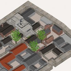
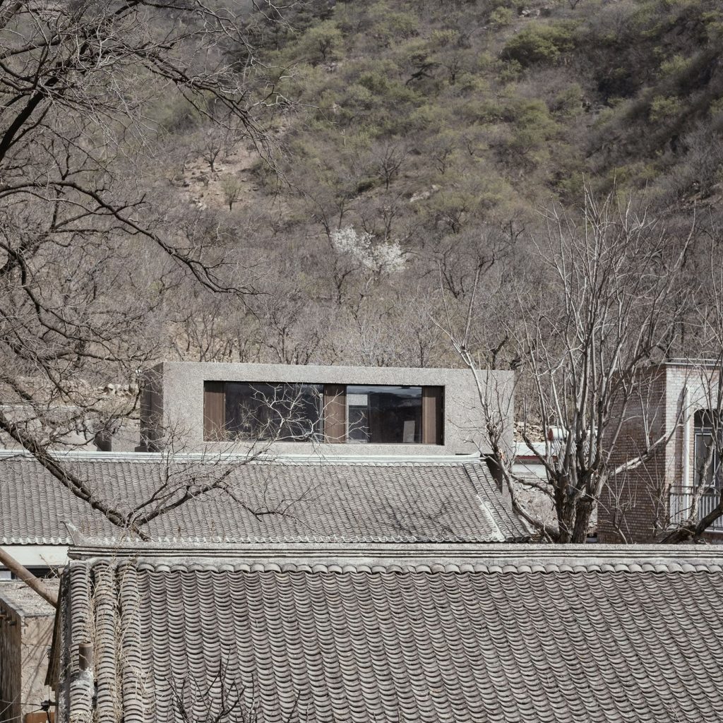
The Yaoziyu Fortness, located in the Yaoziyu Ditch in the north-west of the Jiuduhe Town, Huairou District, Beijing, was built in the Ming Dynasty and is still home to 13 families in what was once a military defence site. The bridge yard, a contemporary courtyard-style residential structure, is located in the north-east corner of the fortress and is a completely new courtyard.
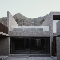
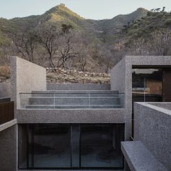
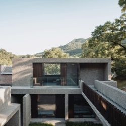
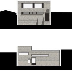
Geometry is the law of lines, planes and three-dimensional forms of space. The building is geometrically shaped, with an overall three-part layout of geometric blocks, consisting of a living area, a roof terrace and a loft house with its own courtyard on the north side, a communal atrium and a kitchen in the middle, and three guest rooms on the south side. Based on the cluttered surroundings of the site, the main strategy of the design is to close the perimeter and grow inwards, addressing the privacy of the residents while allowing the enclosed building entity to evolve into a self-contained internal environment.
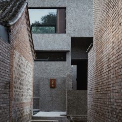
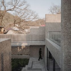
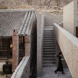
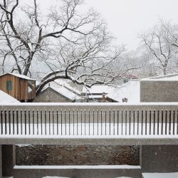
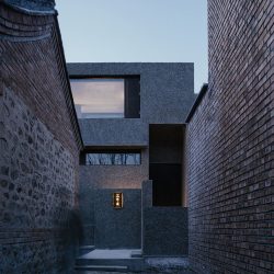
We wanted to design the Slow Courtyard with a contemporary system of thinking. The flexible spatial structure is linked by a distillation of the movement of traditional Beijing dwellings, as one moves around the shadow wall, through the winding passages and open inner courtyards to the main hall and the individual chambers. However, unlike the traditional dwellings, the north and south buildings are separated due to the limited area of south-facing ground but effectively linked. Through the figurative bridge, residents could go back and forth between the buildings, which creates a dynamic, immediate and distinctive inner courtyard landscape.
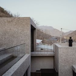
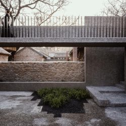
The bridge body and the outward-facing parapet are constructed of an L-shaped cantilever structure, while the inward-facing parapet is embodied in the form of a spaced grille, echoing the virtual and the real, the heavy and the slender, creating a lightness of form that floats in the air. The bridge is deliberately designed to be completely exposed to the outside, which may seem to cause some inconvenience, but this is exactly what we wanted, to give a clear sense of changing seasons and the life spirit by the Great Wall.
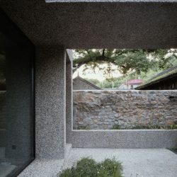
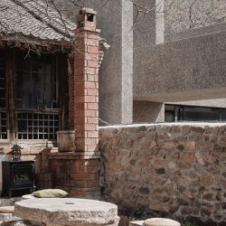
The wall of the neighbour’s house to the west is built high. In the suitable area we have chosen to open up our wall to avoid the immediate impression of total closure and bulkiness that comes with two solid walls. To use the neighbour’s wall directly as our view is a clever way of taking advantage of the situation that we call borrowing. The courtyard is used as the main landscape surface for all interior spaces, emphasising its importance in the architecture, while actively encouraging residents to interact, gather and share in this ‘self-centred’ way of building, which we call self-taking.
Humanity’s reliance on industrialization has reached an unprecedented level, from its beginnings as a convenience to the people to a point of total dependence, where human hands are gradually being withdrawn from making and perceiving into a numbing tool that only taps on screens and deliver food to the mouth. This is consciously and unconsciously changing the way people see and think of the world. We are always vigilant and suspicious of this. Therefore, in this design we wish to bring people back intentionally. By creating the sense of craftmanship through the very fundamental construction methods, we wish people come here to touch, to feel and to think with their deep heart. To really feel a building and thus nature.
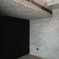
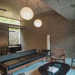
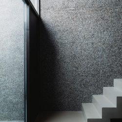
As the main material for interior and exterior finishes, brushed stone emerges from the architectural remains of the Yaoziyu Fortress, which was a common exterior material that is now being forgotten. This material, which has survived the ages, is, in our opinion , the perfect choice for reconstructing the history and memory of the site. The use of brushed stone will allow the building to blend into its natural environment. This seemingly simple and inexpensive material needs to be applied square by square and washed down with water. The work on the walls lasted three months as the number of masters who could use the traditional techniques was decreasing. But the final result was satisfactory. From exterior to interior, from floor to ceiling, a material expresses the maximum of what it can express and emphasises that architecture is not an isolated individual, but one of the multitude that is integrated into the site, not abruptly but with an unique character and appearance.
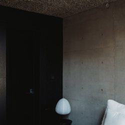
The hard concrete walls, on the other hand, have a different look, being first and foremost the structure of the building, the spatial dividing element, and at the same time a real material with a unique touch. We have consciously selected the concrete walls after the formwork has been removed, leaving a selective number of the more ideal walls exposed. A material, when you imbue it with a vivid sense of functionality, transcends all the laws of composition and the tactile, olfactory and auditory properties of this material are fully engaged, giving a unique, local and adaptive meaning to materials that can only be understood and manifested in this architectural context in this way. The authenticity, continuity and contemporary interpretation of the materials are also a direct response to the interplay between site and architecture, the transformation and the internal articulation of the historical context.
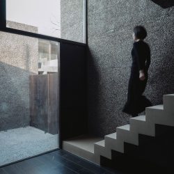
With regard to the window and door system, we had a different idea. Firstly, we have abandoned the more industrialised system of break-bridge aluminium, and have instead adopted a system of square steel keel with bamboo and timber panels as the envelope structure made by workers on site, while considering the openable function as an extension of the ‘door’ rather than a window, avoiding the cumbersome practice of opening windows on conventional glass, and simplifying the toughened double glazing to a single The purity of the building façade in terms of solidity and transparency is expressed, thus making the specific construction effective and pointing to a combination of function and aesthetics. The handcrafted feel of the building is an undeniable testimony to the creation of a tangible entity.
In the dark depths of a traditional Japanese home, shadows huddle in various subtle corners, the dull ground hiding undulating light; the hand-forged traces of tea ware faintly glisten with the sheen of metallic age; the wooden frame of the sliding door is bound with a translucent paper barrier through which soft light radiates, forming a hazy, vague ‘wall of light’. The light is then almost indistinguishable from the light source. So you can barely tell the exact time of day of the light source, which, in this half-obscurity, half-light, so beautifully contrasts and maps the face of things. Junichiro Tanizaki celebrates shadows, and shadows celebrate light.
From the moment you pass through the gate and enter the dark passage, light and shadow alternate and change. We designed the whole building as a container of light, the suspended bridge and the standing wall are the perfect props to portray the shadows, and the whole courtyard creates a rich variation of light and shadow as the sun moves, demonstrating the power of northern architecture. But we did not just seek to cut the space like a scalpel, we used the deeper eaves and the long windows on the north side to create a silk-like softness of light and shadow.
Natural materials take on a warmer quality when nourished by light, and even the hard concrete glows with a hazy light. In addition to the borrowing of natural light, the artificial light is used with the greatest possible restraint, blending the light with the space with the minimum of disturbance. The atmosphere is so deep that it immediately calms the senses, a gift we hope to bring to all visitors.
I remember at the beginning of the year when the project was not yet completed, we jokingly put the blame on the owner for naming the courtyard as Slow Courtyard because of the various difficulties encountered in the project’s progress. In fact, the whole process of the Slow Courtyard from design to construction made us feel the value and meaning of slow. In such an era where Instagram architecture is everywhere and the pursuit of the cart is put before the horse. It has become extremely easy to replicate a building that exists for photography, but it is even more valuable to create a building that is willing to exist for the heart. In her book On Photography, Susan Sontag said, “Today everything exists to end up in a photograph.” And today, we hope that Slow House will do a little to break this fable.
_
Project name: A Bridge under the Great Wall
Project type: guesthouse
Design: nsaaa
Design year: 2020,12
Completion Year: 2022,05
Leader designer & Team: Van Wang,Pan Yiming,Liu Changdong,Joanne Lee
Project location: Beijing Huairou
Gross built area: 248 ㎡
Photo credit: Wang Jianling
Partner: Mr Ma Contractor and Mr Fang Contractor
Clients: Beijing Manyi Limited
Materials: Granitic plaster wall,Carbonized Bamboo Board
Brands: Dasso


