With its new extension, the Jewish Museum on the banks of the Main River is opening its doors to a wider audience.
An area for lectures and symposia, a library, temporary exhibitions, and a kosher café form the ambitious spatial program of the Museum, complementing the permanent exhibition in the historic buildings.
Two eras, one ensemble
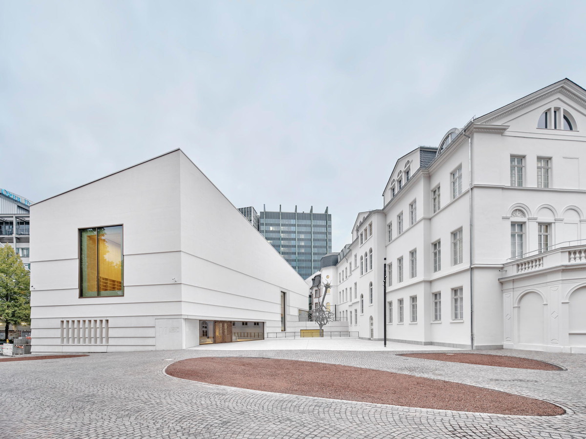
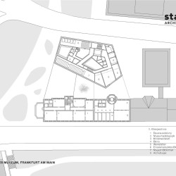
In terms of the urban layout, the new building is located to the back of the classicist buildings.
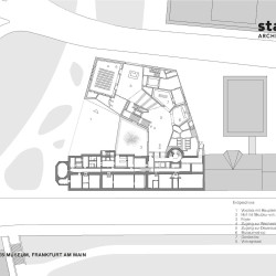
In order to effectively position the extension building with the new main entrance without abandoning the historical staggered arrangement of villa rows, gardens, and service buildings, the new building was designed as a robust solitary structure set at a distance to the old buildings.
Towards the lateral ramparts, however, it is perceived together with the old buildings as an ensemble that encloses a square that serves as the new entrance courtyard and future address of the museum. The square opens up towards the ramparts and closes in the depth of the property. The public forecourt is followed by a small sunken garden, which is bordered by a raised café terrace. The connection be- tween the new and the old buildings runs under this terrace.
The subtle differentiation in height creates different exterior spaces and simultaneously solves the complex functional relationships and safety issues of the museum.
An unexpected spatial experience
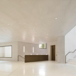
The outline of the extension is mainly a result of the urban planning situation, while the interior follows a clear spatial idea. Starting with a monolith, as a counterweight to the existing classicist buildings, and a central hall carved out of this building volume, the entire program of the house was made visible at a glance.
Entering the hall from the main entrance, the event area with a small foyer is straight ahead. On the side, a wide staircase leads to the permanent exhibition in the old buildings and the temporary exhibition on the lower level. Above it, one looks through windows into the café and the library.
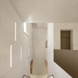
The large fair-faced concrete surfaces and the flowing layout create an almost archaic spatial impression, the effect of which is further enhanced by the light shining in from above. From this central point, visitors can intuitively find their way to the various services offered by the museum, whether on the different levels of the new building or in the historic buildings.
The façade of the new building reflects its time of origin but picks up characteristics of the classicist building façades with the plaster colour, the emphasis on the plinth and the horizontal structuring of the façade. The ensemble effect of the two parts of the building is thus strengthened on various levels: in terms of the urban layout through the balance of the building volumes and the framing of the new en- trance courtyard, functionally through the joint routing and on the façade level through an exciting dialogue between old and new.
Careful restoration of the Palais
By removing fixtures from the 1980s, the historical structure of the old buildings was made legible again. The well-preserved rooms in the Rothschild Palace have been restored in accordance with the preservation guidelines. Their atmosphere contrasts with the museum spaces in the Palais at Untermainkai 14, which no longer had any original surfaces and were given a simple appearance. The rooms in both buildings were combined to form one exhibition tour.
Invisible from the outside, two elevators provide barrier-free access to all exhibition areas in the old buildings.
_

