Michael Aurel Pichler Architekten . photos: © Michael Aurel Pichler Architekten
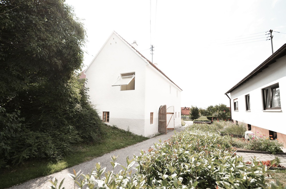
In a quiet old street in Hohenried, a small village in Bavaria, exists a house from the 1920s. It served the village as a small town hall and housed in its history other different functions. The clear-cutted and concise Figure with an overlain steep roof made of red bricks is typical for the region and blends into the existing Parataxis of the old road.
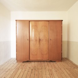
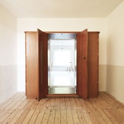
The concept is based on a thesis of legibility of the old and the new: space and surfaces interpreted as palimpsest. The reorganization and clarification, the reinterpretation and the opening of new references by the “overdrawing” of the existing are the result of this design attitude. The history can be read at various points such as the original windows and the old door of the eastern part in the basement or the artisanal roof framework. Existing features such as the old trickle plaster of the facade were repaired and preserved. Coexisting new ingredients are added, such as the outward-folding wooden windows on the upper floor or the spatial cupboard, which like a counterpoint, sets the old decrescendo a new crescendo of spatial opening and connection, a new legibility.
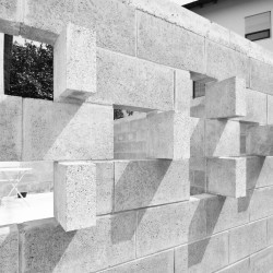
The continuous space is a central motive for a reorganization of the building. In former times, two corridors provided access to the unities upstairs. The structure of the house is reinterpreted by the connection and dissolution of the eastern corridor and the joining of the cupboard as a connecting spatial element. Different atmospheres, references to the outside and materials are new qualities that activate the old spatial structure. The limewashed walls, various woods and the wallpaper-like floor bind together formerly inconsistent rooms. As an annex to the south, a new courtyard made a kind of “wickerwork masonry” complements the living room. The enlarged door in the west is a part of a renovation in the 1970s. With plastic laths of larch wood, the figure of the old door was shaped like a kind of sundial into a reminiscence to the history of the house, depending on the time of day and the season.
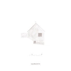
The east facade receives a new hierarchy by the joining of a window which, as an asymmetric gravity field, counteracts the slope and redefines the visual weight of the façade. From the inside, the window establishes a relationship with the spatially introverted old street. The pedestal spans a new theme as a triad over the façade of the two-storey building and, like the window of the eastern façade, counteracts the optical tilting into the slope.
_

