NOT BAD . photos: © BoysPlayNice
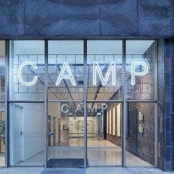
CAMP, the Center for Architecture and Metropolitan Planning, is an urban planning hotspot in the heart of Prague aiming to improve public discussion about the development of the Czech’s capital city. Striving to become an essential source of clear and accessible information about the present and the future of Prague, it functions as an open platform, a “basecamp” for anyone interested in the collective planning and development of the Capital.
CAMP’a mission
Urban planning hotspot
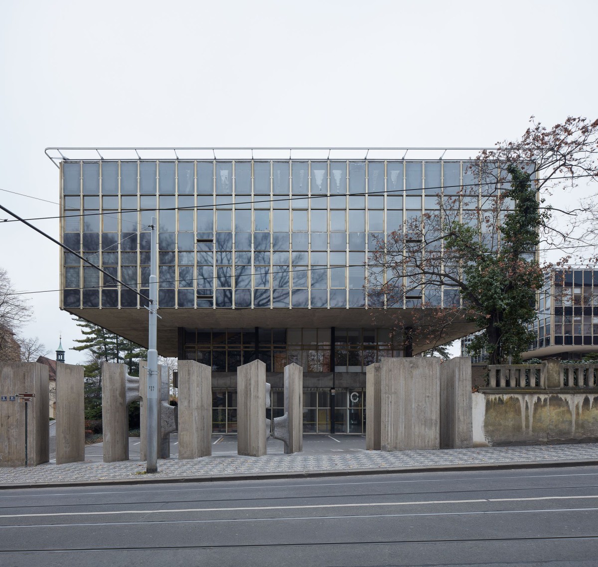
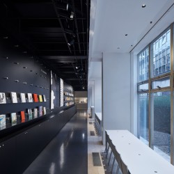
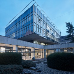
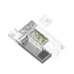
Housed in a modernist building designed by a famous Czech architect Karel Prager, CAMP shares the address with its guarantor and implementer Prague Institute for Planning and Development. CAMP hosts a 200 m2 exhibition hall with a unique, large projection screen, a library with a large selection of publications about architecture, urbanism and design, a café, an outdoor patio and a modern lecture hall.
Urban(ism) – a public matter
CAMP is a meeting place for architects, planners and citizens, a hub for brainstorming the future of the cities, with a diverse programme of public discussions, lectures, workshops, film screenings and other activities addressing the sustainability of our cities.
Along with different kinds of workshops addressing the Prague’s present and future, CAMP regularly host famous international architects in one of its lectures and discussion cycles – Urban Talks. Among the guests presenting their work and discussing the specificity of the architecture and urban planning of their countries were Santiago Calatrava, Sou Fujimoto, Smiljan Radić, Snøhetta, COBE and other experts from all around the globe.
Accessible to all
Launching a programme for children and adolescents which explains them how the city they live in functions, CAMP reaches out to citizens of all ages.
It also strives to be accessible for people with mobility limitations and reduced orientation in space, as well as those who have problems perceiving the written text, image and sound. This involves translating their website into sign language, making info-materials in enlarged black print and Braille and preparing the subtitled videos and audio descriptions, making it deaf and blind-friendly.
CAMP’s accessibility also follows through its space – from simplified entry, movement and clear navigation, to the induction loops installed in the halls and the café.
Live streaming the lectures, discussions and certain events complements these efforts and brings CAMP to the people world-wide.
Architectural tram
CAMP also stepped out of the Prager’s walls and virtual space on to the streets of Prague. In cooperation with the Public Transportation Company an architectural tram was created, running through the streets of Prague for several months, regularly hosting guided tours.
_
CAMP – Center for Architecture and Metropolitan Planning
Concept authors Adam Gebrian, Eugen Liška, Adam Švejda
Architectural studio NOT BAD
Architects Benedikt Markel, Dominik Saitl
Collaborators Martina Požárová, Vilém Kocáb
Project location Vyšehradská 51, Prague, Czech Republic
Project year 2017
Completion year 2019
Gross floor area 1100 m2
Investor City of Prague
Implementer Prague Institute of Planning and Development
Photo credits BoysPlayNice
Collaborators
Visual identity Ex Lovers & Martin Groch
Project CONTRACTIS
AV presentation st.dio (Josef Kortan, Jakub Roček)
Lighting Ateliér světlené techniky (Ladislav Tikovský)
Electrics Apollo Art (Jaroslav Zuna)
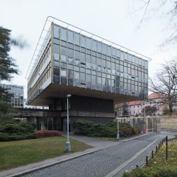
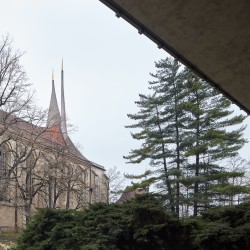
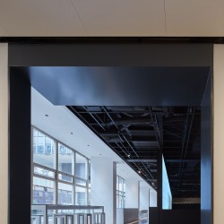
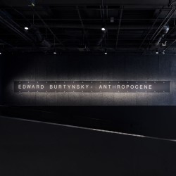
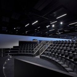
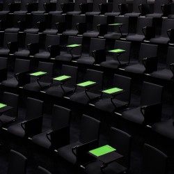
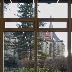
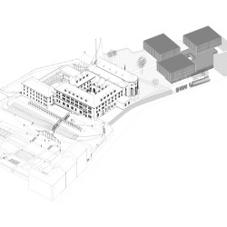
The Center for Architecture and Metropolitan Planning resides in a building designed in the 60s and built in the 70s by the significant architect Karel Prager, located in the bombarded section of a medieval monastery complex. A set of three dark prisms with a light surface shell, elevated above the ground on top of two storey pedestals, served as a facility space for the Design Institute of the City of Prague. The Large exposition hall (the “Baucenter”) was already included in Prager’s concept, however apart from a few expositions in the early 90s, the space never served its original purpose until the opening of CAMP. Even though the project was not a general reconstruction of the building complex, during the process of designing CAMP, great importance was appointed to the conservation of the original architecture by Karel Prager. Notably, in the case of the two halls, a great deal of effort was given to make use of their generous spaces and to maximize the palette of usage they offered. Thus, two multi-functional halls that are the core of CAMP were created. First came the disposal of unintended installations and partitions and the designing of a new system of division into exposition and service spaces. The original high-quality materials of ceramic wall tiles and limestone floors emerging from the interior into the exterior were excavated from under layers of later-on additional installments. On the contrary, all the newly designed elements and layers were placed as clearly identifiable and contrasting. The larger “black” hall with the capacity of up to 250 visitors, completely blocked of daylight, is dominated by a panorama projection surface of 24×4 meters with an 8K resolution. This projection surface offers new possibilities in terms of working with images and, aside from audiovisual tracks accompanying expositions and lectures, provides also, for example, a 1:1 scale simulation of an urban city space. Annexed to this hall is a small arena used for discussions, smaller lectures or a movie theater. The library, along with the study hall and bookstore, is on the back side of the projection wall. It gets plenty of sunlight from the generous glass atrium that lies in the center of Prager’s blocks. The “white” conference hall is in a counterbalance to the dark exposition hall, with its munificent three-sided transparent surfaces. It is convenient for conferences, group meetings, presentations or specific expositions that can endure the flood of sunlight. The entrance hall and café are a node point for both halls and offer enough dispersion space, easing orientation and allowing a view into both halls. In case of a large event, this allows a “pouring” of a program from one space into another in order to allow their spatial qualities to synergically complement each other. The interior of CAMP was created in a close collaboration with the authors of its visual identity and therefore can be considered its primary and key application. This concept is based on points in a square grid whose base subject is the work with scaling and density. The fundamental application of this grid in the interior is derived from the format of the original ceramic tiles, a dominant and authentic element of Prager’s architecture. Node points in the grid are materialized by atypical stainless steel screws and nuts creating shiny cylindrical joints. These serve as an anchor system for exposition panels, furniture joints or as space navigation.

