John Pawson . photos: © Valextra
The iconic via Manzoni space has been through several aesthetic reinventions, in parallel with the company own creative evolution. By tradition, the brand hands over the store to a different architect or designer every year, merging its luxury leather expertise with the worlds of design, art and architecture. Each creative voice who added to the Valextra story has contributed to the brand, s evolution and strengthened its artistic legacy. The past four years have represented an aesthetic journey through conceptual interventions, and each project has unveiled a new moment in the brand’s growth: designer Martino Gamper’s brilliant ingenuity, architect Bernard Dubois’ brutalist softness, American design duo Snarkitecture’s monochromatic experiential tactility and Japan architect Kengo Kuma’s ultimate interpretation of the natural world have forged the company’s identity to reveal a multifaceted, rich personality.
The latest chapter in this creative narrative is a sum of these experiences and a rectum to Valextra’s original purity: after these successful visual experiments, their creative apex is represented by a new, complete vision for the space. The brand worked with John Pawson on a longer-term interpretation of the store marrying the minimal, clean elegance and restrained luxury of its minimalism with Pawson’s own philosophy of space. By choosing to collaborate with one of the ultimate pillars of contemporary architecture, Valextra combines its history with the philosophical stance of the architect, merging its heritage with Pawson’s own legacy. This intervention will act as a flexible canvas for Valextra, function both as a retail space for its products and as a gallery for a series of art exhibitions.
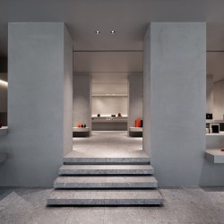
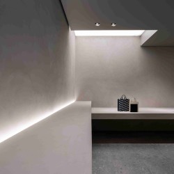
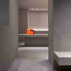
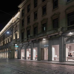
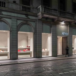
Pawson’s project considers the space as a whole, incorporating key aspects that have come to define his work, from a monochromatic palette to the use of light and the seamless integration of new elements within the existing architecture. From the street, passers by can see all the way into the store, which has been opened up structurally to create a welcoming, immersive, luminous environment, reinforcing the impression that this is Valextra’s home in Milan. Inside, guests are encouraged to walk through a sequence of three rooms, each incorporating the subtle drama of a different light identity.
The space appears rigorous, monumental; this is an all-encompassing, pure architectural project which entirely redefines the scope of the store’s interiors. The vision of the intervention is not simply to create a container for the product, but a spatial narrative that enhances the experience of proportion, surface and scale. The architectural language of simplicity produces a gallery-like interior, whose charged character derives from the restrained use of color and light.
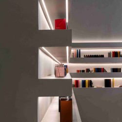
The design is based around a series of compositions featuring suspended with the existing ceppo di gre floors. With each individual piece fabricated by hand, the installation, much like Valextra’s bags, reflects the commitment required to realize an apparently simple vision. At the back of the store, the floating elements are replaced by a generously scaled table that visually anchors the space. A sequence of mirrors offers graphic glimpses of the surroundings, enhancing the sense of openness that lies at the core of Pawson’s work.
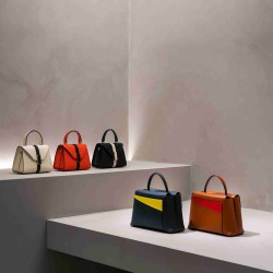
As a debut for the new face of the Via Manzoni store, Valextra presents its Spring/Summer 2019 collection-a series of classic pieces featuring hold, graphic motifs. The brand s most iconic bags, from the Iside to the Brera, are presented in a bright palette of emerald green, cedar and lobster red, contrasting with black and white shapes and alluding to 90s graphics. Located within the context of Pawson’s sensual but rigorously pared back installation, these colorful pieces will speak powerfully of the dynamism of Valextra’s aesthetic vision.
_


