BETILLON & FREYERMUTH ARCHITECTES
In a text written in 2001 entitled The Default Aesthetic,Vanilla flavored beauty, the artist Etienne Cliquet, defines the bases of a new aesthetic appeared on the Internet of the relation between man and machine. It shows itself in the form of oldfashioned, simple interfaces, result of a collaboration man / computer in which the design is totally absent. Indeed, the established dialogue can be only pragmatic, the machine lacking any shape of sensibility.
_
·
“Vanilla” sends back to the favorite flavor of the ice creams of the Americans. It is considered as the taste by default, the one that we choose naturally to satisfy the largest number. We like it by default …
An internet platform as indexhibit, for instance, illustrates perfectly this said characteristic “vanilla”: in spite of a total absence of elements of design, an esthetic by default extremely attractive radiates from the minimalism, the simplicity of use with the visible tree diagram.
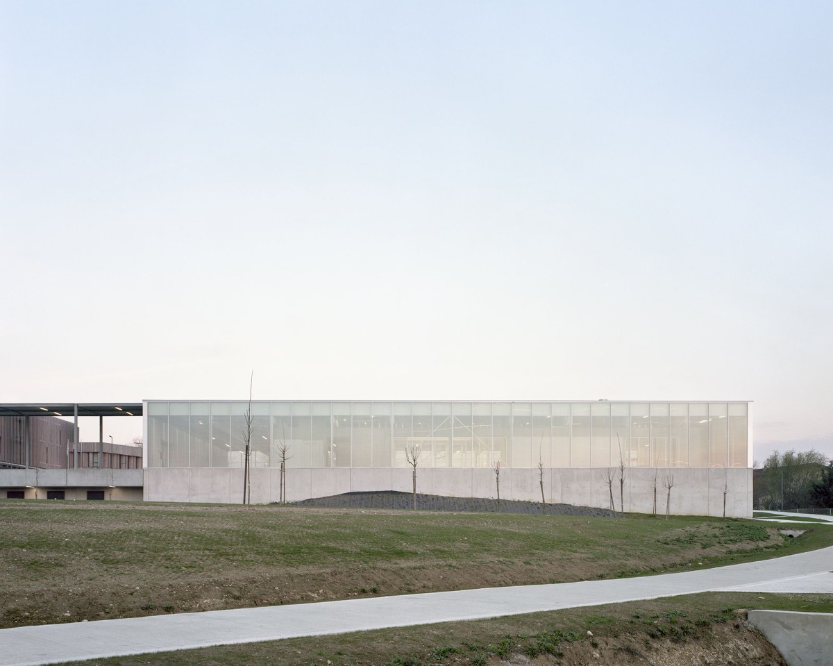
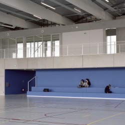
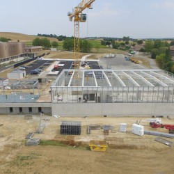
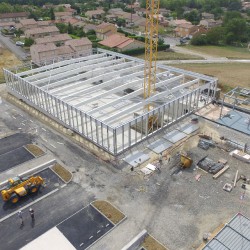
In the project of Villefranche de Lauragais’s Gymnasium and more generally in the works of the agency, esthetics by default also radiates from our architecture thanks to its pragmatism. We try to avoid at the most the pitfall of meaning, full of imagery architecture. The interest is somewhere else: in the generosity of spaces, in the creation of a variety of spaces, in the changeable climatic or bright qualities.
If we take the definition of an interface: “layer limits between two elements by which take place exchanges and interactions”, it resounds as a possible definition of the architecture.
So the architecture of a gymnasium is the constructed interface which allows the body to carry out sports activities. The echo works.
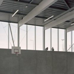
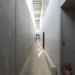
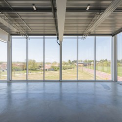
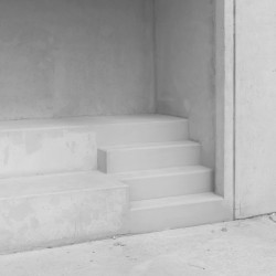
Thus the interface proposed for Villefranche de Lauragais’s gymnasium claims its filiation with the aesthetic described in its article by Etienne Cliquet. The gymnasium draws its esthetics from the precise assembly of rough materials and not configured. The visible technical and structural elements participate in the organization of the space, in its harmony in the same way as a visible tree diagram participates in it in contemporary computing interfaces.
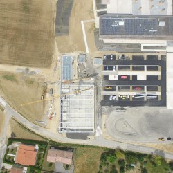
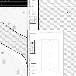
During the competition, we tried hard to answer with the same pragmatism the questions lifted by the program. The gymnasium is on a sloping ground, in the joint of several other equipment, a track, a parking lot and a high school. The architectural bias by aligning the various playgrounds creates a big overhanging square, so assuring connection and coherence between the various equipment of the zone.
The proposed aesthetic and the simple but radical interpretation (performance?) of the program contribute to give to this project a taste of Vanilla architecture in which we recognize ourselves.













Comments are closed.