Herzog & de Meuron . photos: Margherita Spiluttini © Architekturzentrum Wien . + nextroom
Schaulager: a new building type?
What is the point of a Schaulager, of a building in which art is stored but still accessible for the public to view? What ideas about art and a collection strategy are involved, and what is the best architectural and urban development concept for it?
_
We were not aware of any comparable building type that could address and express all the problems posed, so of course we felt fascinated and challenged, and had an equally rigorous dialogue with the clients.
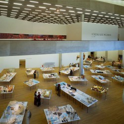
The brief was for a warehouse for contemporary art, where works take up considerably less space than in a museum because they are hung side by side on the walls and placed closer together on the floor. The works stored here are unpacked and arranged in accessible spaces, installed according to the artists’ intentions. The conditions under which the works are kept visible correspond to international conservation standards; they are maintained at levels of light, temperature and humidity determined as ideal for storing artworks. The works are thus in an ‘optimal condition’ for viewing. Offices and workshops, an auditorium and the necessary loading and unloading facilities round off the spatial program.
In our initial designs we tried to condense the idea of storage into a single vertical and a horizontal area. A gigantic wall would have accommodated all the wall-mounted art somewhat like a junk-shop; the rest of the work would have been distributed over a floor area without dividing walls. A complete overview of the collection would have been possible at one glance in this vertical and horizontal storage area. But technical and curatorial considerations regarding conserving and transporting the works of art soon pointed the project in another direction. It turned out that a proper warehouse with robust floors and walls and large spans would offer the most advantages and paradoxically the greatest flexibility as well.
A heavy building
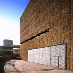
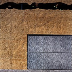
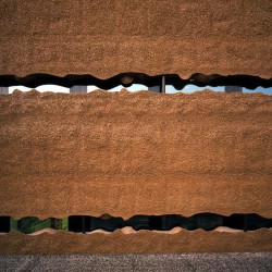
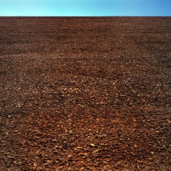
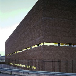
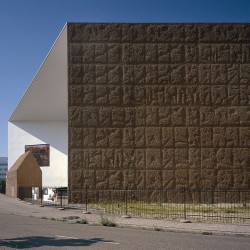
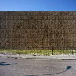
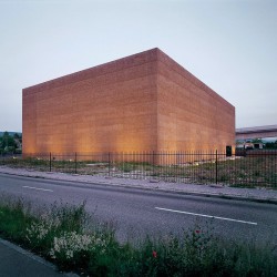
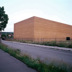
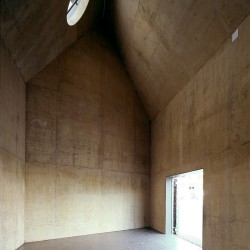
So we tried to develop a kind of architecture that would express the floor-by-floor storage and stacking pictorially as well: as something durable and solid, in contrast with today’s aesthetic of computer-controlled storage facilities and the inevitable light-weight design. The heavy outer walls would rise in layers and their surface would be scratched. This means that the walls reveal the pebbles from the building work excavations. These layers of material express load and support simply and vividly, and their great inertia is also a key factor in the climatic control of the interior of the store.
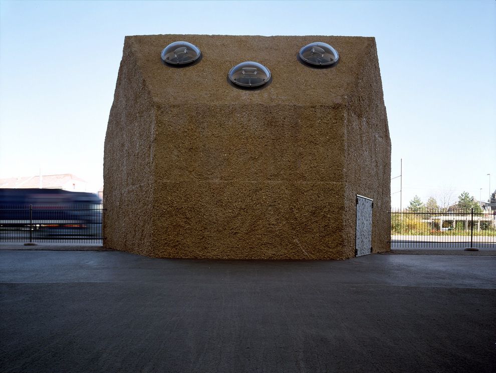
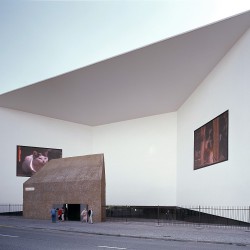
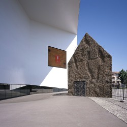
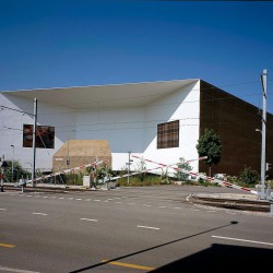
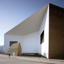
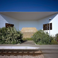
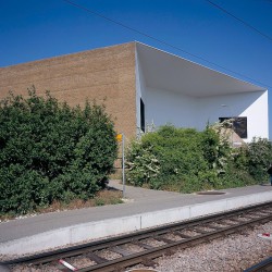
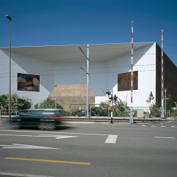
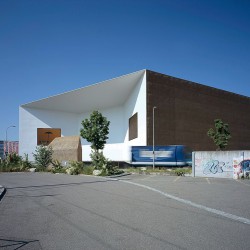
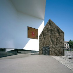
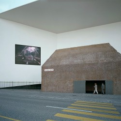
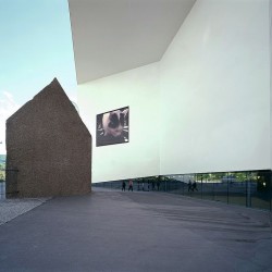
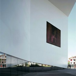
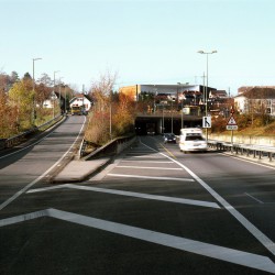
The external shape of the warehouse is pragmatically derived from the geometry of the internal storage arrangements and the setback requirements of the building code. This led to a polygonal building made out of materials extracted on site and looking as if it had been extruded from the ground. The façade of the polygon facing Emil-Frey-Strasse is indented to create a kind of forecourt, which identifies the entrance area visibly from a distance. This entrance seems to be guarded by a little building with a gable roof, constructed from the same earthy material as the warehouse. Together the little gatehouse and the indentation form a courtyard-like space with a metropolitan ambiance. So the Schaulager is not simply an anonymous warehouse somewhere on the urban periphery. It is a place that is usually quiet, but still active and self-confident, extending the public dimensions of the city of Basel to the south, towards the new district of Dreispitz/Münchenstein. The public, urban character of this new site is reinforced by two large LED panels, on which works of art commissioned by the Schaulager are communicated to the outside world.
Walls, windows, surfaces as digital landscapes
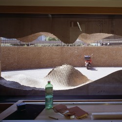
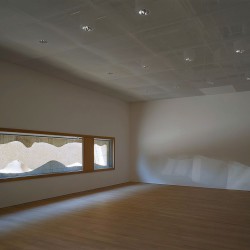
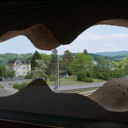
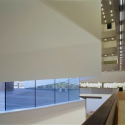
The gravel material excavated on site was used to construct the walls, but it also determined the forms and surface structures of other parts of the building, inside and outside. The window sections seem like natural forms but are actually calculated forms, produced with digitally controlled tools and modeled after the natural shape of the pebbles on a larger scale. Thus a kind of artificial yet natural landscape is created within the window apertures, so the window does not serve primarily to provide a view of the at best trivial landscape of the urban periphery, but is a landscape in its own right.
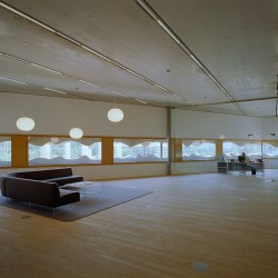
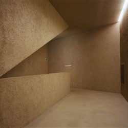
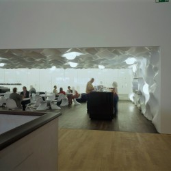
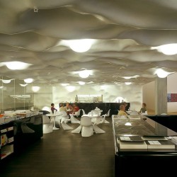
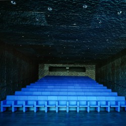
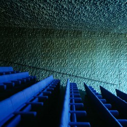
We used the same digital landscape profile for the cladding of the walls and the ceiling in the foyer. By ‘unrolling’ the profile, we produced a cave-like, polished white surface structure. The metal grilles used in the auditorium and for the gates are much more directly related to the natural model of the gravel surface, having been generated by a rudimentary frottage technique and transferred to a stamper at a scale of two to one.
An entrance hall with an overview
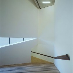
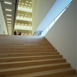
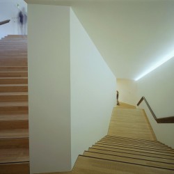
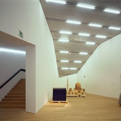
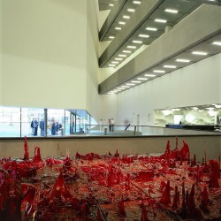
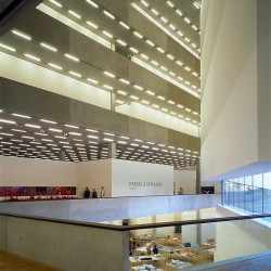
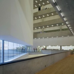
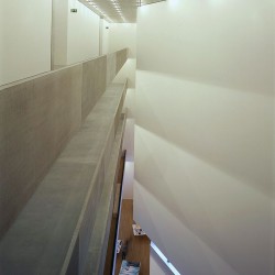
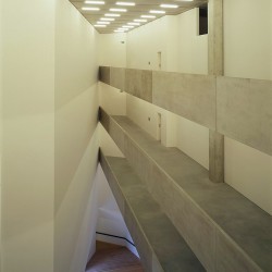
In the interior the floor panels for each level are cut out in such a way that an atrium-like space rising through the full height of the building is created. The surprising perspective effect made by this entrance hall is built on the two simple elements of a warehouse: the floor panels, which look as though they have been stacked here, and the lighting, which we arranged on a strictly linear pattern.
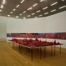
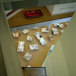
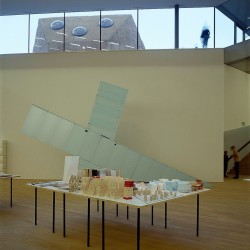
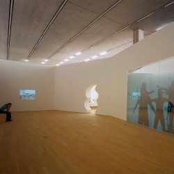
The entrance hall gives a complete view of all the building’s spatial levels, and makes it possible to look right down into the various floors. The two lower floors in particular open up for visitors as soon as they come in. Here we have the exhibition halls that can be freely partitioned for temporary shows, and the permanent installations by Gober and Fritsch. The upper levels, divided into cells, are used as tailor-made storage areas for the Emanuel Hoffman Foundation’s collection.
Spatial program
The art storage space in the 3 upper stories occupies 7,250sqm, the largest proportion of the total available area of 16,500sqm. 3,650sqm are provided for exhibitions on the ground and basement floors. The permanent installations by Robert Gober and Katharina Fritsch take up 260sqm and 390sqm respectively. Administration uses an area of 800sqm. The whole art handling area and the workshops also cover 800sqm. The 144-seat auditorium and the seminar room fit into 250sqm. The remaining 3,100sqm are used for access and services.
Herzog & de Meuron, 2006
_
Schaulager, Laurenz Foundation
Basel/Münchenstein, Switzerland
Project 1998-1999, realization 2000-2003
Herzog & de Meuron Team:
Partners: Jacques Herzog, Pierre de Meuron, Harry Gugger
Project Architects: Philippe Fürstenberger (Associate), Cornel Pfister
Project Team: Senta Adolf, Nicole Hatz, Ines Huber, Jürgen Johner, Carmen Müller, Katja Ritz, Marc Schmidt, Florian Stirnemann, Lukas Weber, Martin Zimmerli

