Austin Maynard Architects . photos: © Peter Bennetts Studio . + archilovers
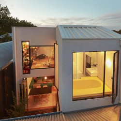
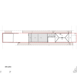
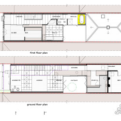
Mills is an extension to a one level weatherboard terrace in Melbourne. The original facade and front 2 rooms of the terrace remain. One of those rooms has been altered to incorporate a study and a bathroom. A large lightwell separates the original structure from the new extension. The extension has two bedrooms and a bathroom above an open kitchen, living, dining space.
Mills is a complex home, full of ideas, however there are 2 core elements.
1. The floor is a giant toy-box.
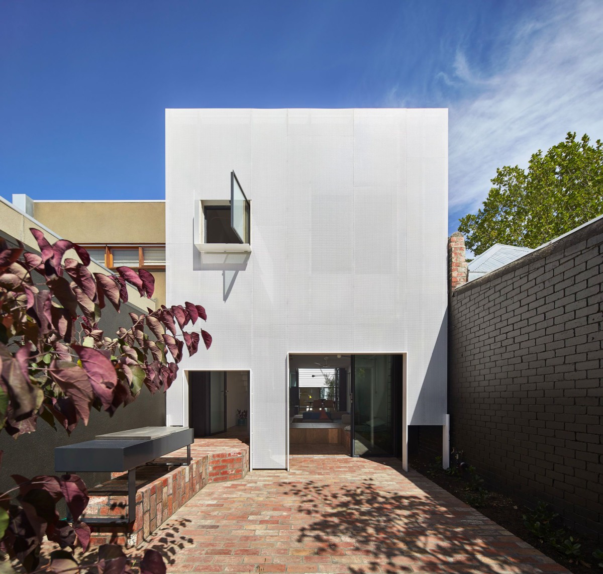
2.The rear facade filters and softens the strong sunlight that had previously dominated the backyard.
–
Mills, the toy management House
In a nutshell
She’s a senior executive and now a new mum. For her and her newborn baby she wanted a light-filled home that could hide the mess. We gave her a floor that was a giant toy-box.
The what.
Mills is an extension to a one level weatherboard terrace in Melbourne. The original facade and front 2 rooms of the terrace remain. One of those rooms has been altered to incorporate a study and a bathroom. A large lightwell separates the original structure from the new extension. The extension has two bedrooms and a bathroom above an open kitchen, living, dining space.
Mills is a complex home, full of ideas, however there are 2 core elements.
1. The floor is a giant toy box.
2. The rear facade filters and softens the strong sunlight that had previously dominated the backyard.
The floor is the cupboard.
Everyone wants an abundance of storage. Terrace homes are roughly 6 metres wide. After adding walls, corridors, stairs, heating panels and cupboards we are left with very little width for living space. What if we didn’t have wall cupboards? We’d get almost 1 metre of space back into the width of our terraces. What if our storage space was within our floor? Floor space is often left to the mice and spiders. Let’s convert the floor into storage space and make the living area as big as possible without lining the walls with bulky cupboards.
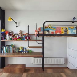
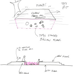
Beyond the need for storage we were also concerned with the radical day-to-day changes a new baby brings. The endless management of ‘stuff’ was the key. Gravity is colluding with your child and conspires in its favour. Parents constantly pick things up, whilst kids throw them down. Children seem to love dropping things on the ground. We have all seen the torturous game of a baby sitting in a high chair throwing a toy to the ground the moment it is placed on their table. It’s cute the first three times. It’s a nightmare the next 200 times. While gravity amuses the child, it punishes the parent. The trick is to work with the chaos a child brings rather than naively hoping that your child will choose to be neat. At Mills we have made gravity the parents’ ally rather than the child’s by enabling the floor to swallow all the mess. Rather than picking toys up to put back in the toy box, we’ve made the floor one big toy box. Let’s get a broom and sweep all the lego in from the top and sides. It becomes a game for the child as well as a new hiding place to play.
450 is the magic number.
The toy-box floor is 450 millimetres deep. A typical seat is roughly 450 millimetres high. The open floor is not only storage space, it is also play space at a comfortable seat height for adults. A kitchen bench is roughly 900 millimetres. Therefore a kitchen bench is two seats high. The kitchen sits on the original floor height therefore the bench is 450 millimetres above the new toy-box floor. The kitchen bench is a seat to the new floor. We’ve upholstered a seat under a flap on the kitchen bench so that there can be one extra seat at the dining table when visitors are over, or when Louis wants to cook with Mum. Furthermore, the lightwell garden is at the new floor height, 450 lower than the benchtop, which makes access to the herbs very easy. 450 is the magic number.
Corridors are wasted space.
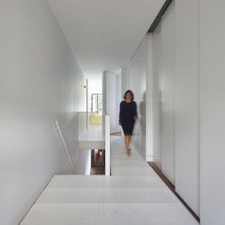
We like to give corridors dual functions. The kitchen at Mills occupies the original corridor space. Therefore the substantial space the kitchen would have occupied in a typical location has been used as living space. Upstairs the master bedroom wall can slide entirely away so that the room can increase almost 2 metres in length when open to the corridor.
Perforated metal.
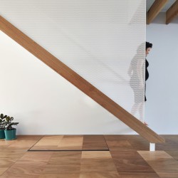
We’ve used perforated metal throughout Mills. Stairs are tricky, especially in tight spaces. We have tried to create a stair that feels light like lace, which is difficult considering the constant live loads a stair is under. Perforated steel sheet is folded allowing light to be shared while also enabling conversations from one level to the other, without requiring you to be in the same space. One can lounge by a sunny upstairs window while having a conversation with someone below. Although it is a small home with numerous spaces, we’ve avoided creating isolated cells by using translucent materials like perforated metal.
We’ve also employed perforated metal to control sunlight. We all want an abundance of sun in our homes, however too much sunlight makes any home very uncomfortable. The rear facade of Mills faces North-West, therefore it gets hit with the most aggressive sunlight of the day. Before the renovation the owner had felt very uncomfortable at the rear of her house. We’ve draped a white perforated metal facade down the face of the rear elevation. The facade reflects most of the unwanted sunlight in summer, allowing a soft filtered light to penetrate the house. The lines between inside and outside have been blurred. The glass walls of the living space are offset from the perf facade which creates a comfortable outdoor space that feels as though it is within the skin of the house. The facade feels solid and protective on a bright, hot day. On a dull day, at dusk and in the evening the facade appears far less solid and the metal skin feels more like lace than a wall.
That bathtub.
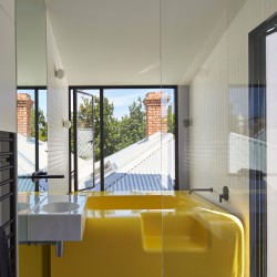
The bathroom is not big, therefore we have created very large windows towards the lightwell and towards the original roof. This makes the bathroom seem large, sunny and bright.
No one likes cleaning a bathroom. Adding a bathtub to a small space creates a lot of fiddly details where grime, mess and mold can gather. To avoid the mess, and to create a bathroom that was easy to maintain, we made our own bathtub out of fibreglass. There are no seams or joins. Along the walls a slim, continuous gutter that ensure water runs around the bath and drains through the floor. Simple, neat and clean.
Sustainability.
Like all of our buildings, sustainability is at the core of Mills House. Although the site is small we have maximised natural light and air to all spaces. The openings and windows have been designed to optimise passive solar gain, thereby drastically reducing demands on mechanical heating and cooling. All windows are double glazed. White roofs drastically reduce urban heat sink and heat transfer internally. A need for air-conditioning is eliminated through active management of shade, and passive ventilation. A large water tank has been buried central within the lightwell. All roof water is captured and reused to flush toilets and water the garden. High performance insulation is everywhere, even in the walls of the original house. Where possible we have sourced local trades, materials and fittings. Solar panels with micro-inverters cover the new roof.












Comments are closed.